Lecture 1
Affordances :⌗
Good example :⌗
gear level :

Just by looking at the scheme on the gear level we instantly know how to use it. In fact, when the car is in neutral gear, just by looking at the scheme you understand that you have to put the gear level in the upper-left corner, and it’s the same when you want to shift gears even if we can’t see the mechanical pattern.
Light switcher in the corridor :
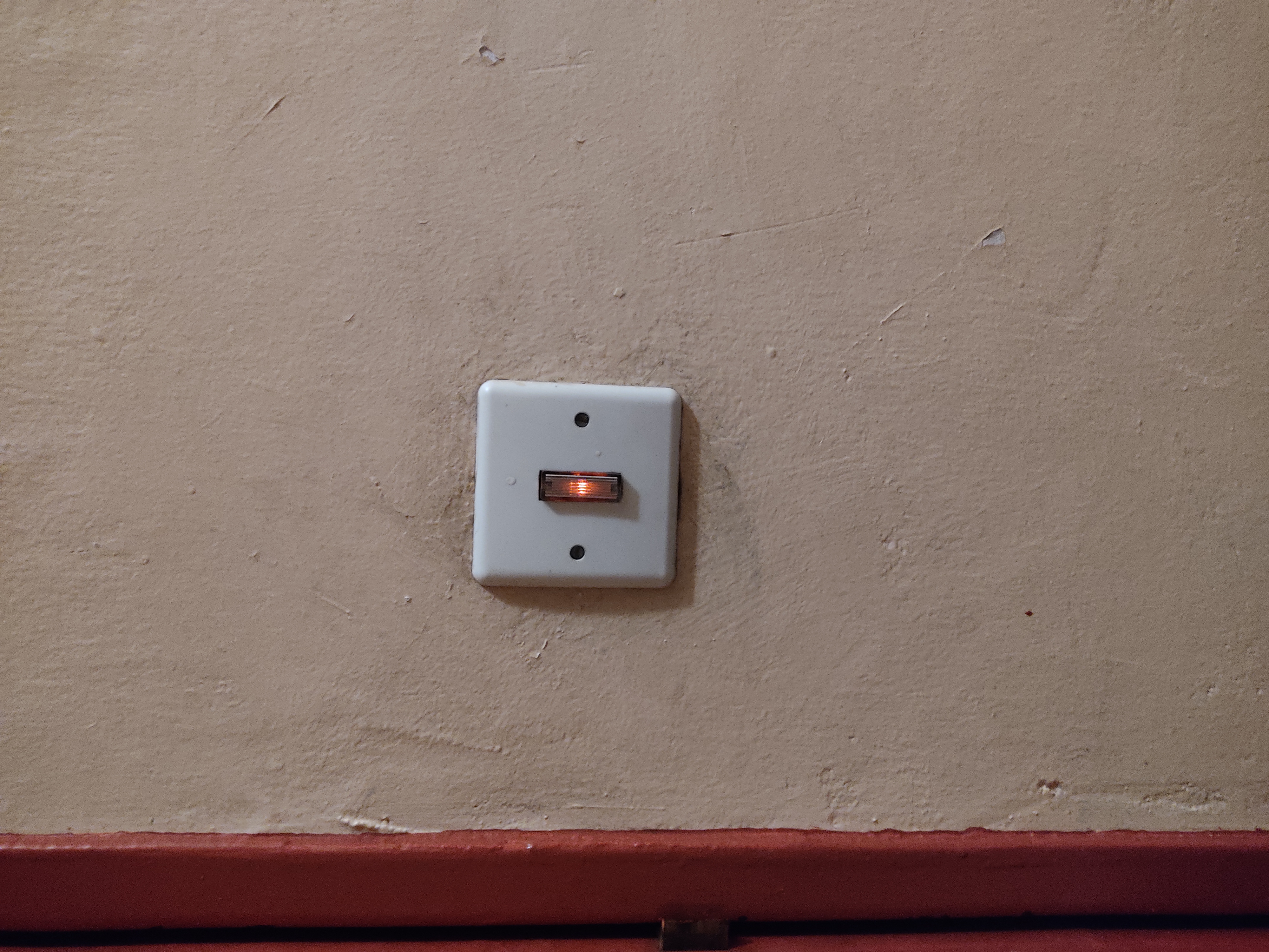
An other good example of affordance is these lighted switchs in corridors, since in corridors we can find switch for lights or for doorbells which sometimes look (or feel) the same (especially when you are in the dark). This light inside the switch directly indicate us that is for switching on the light.
Bad example:⌗
RC commander :


When I was a kid I remember using two types of controller for my RC cars, one looked like a playstation controller with two directional sticks (which was easy to use) when the other one was the one on the picture. And since I wanted to turn the RC car left or right, I remembered making some mistakes because I could only turn the directional wheel forward or backward. One easy way to fix this problem is to rotate this directional wheel in order to be able to turn it to the left or the right.
Gestalt law :⌗
Elevator :
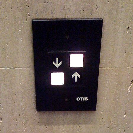
Here is a perfect example of bad gestion of the Gestalt law as, if you are in front of this elevator it’s hard to know which button you have to press for instance if you want to go up. The problem with this lift button is, if you want to go up, we don’t know if you have to press the upper-right button or the bottom-left one since we usually regroup items horizontally or vertically, and here there is both with no separation (it’s the same problem if you want to go down). One easy way to fix it is to fix the arrow directly on the button or simply draw a white line to separate the two options. I’m just giving here a bonus illustration of the same problem.
Diesel :
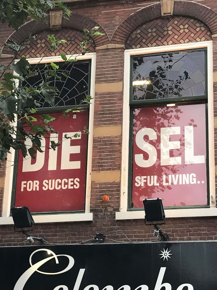
The 2nd example is this Diesel advertising which is pasted on two windows, and because of the gestalt law we see 2 words : “die” and “sel” and I don’t know if the word “die” is good for business. One way to fix it is to reduce the size of the ad and put one on each window.
Bonus :

I wanted to add a natural illustration of the gestalt law, in fact we have an illusion of a leaf inside the leaf on this plant.
Dark Pattern :⌗
Nba 2k :
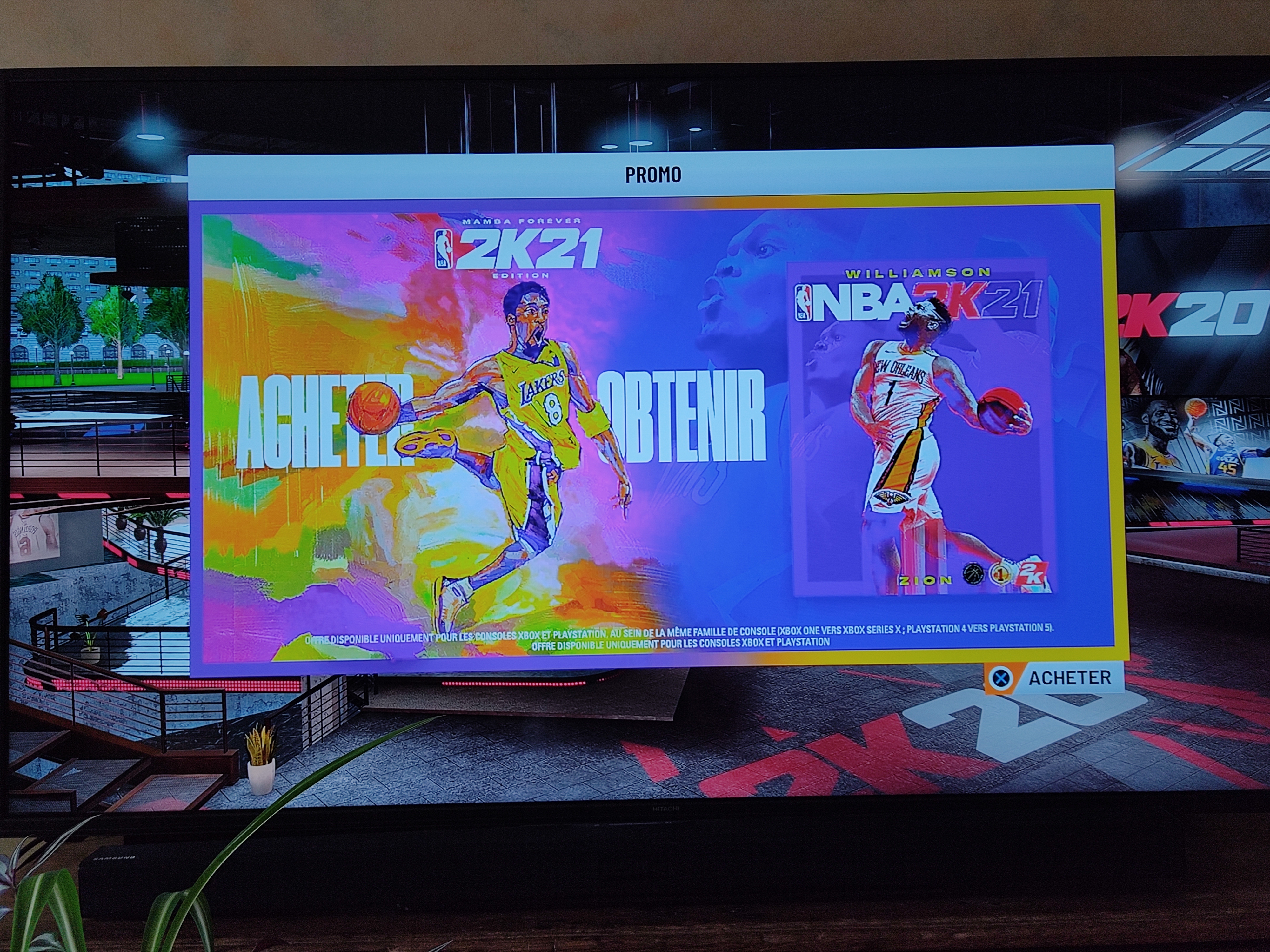
When you open the game you have this window which suggest you to buy the new released game just by clicking the “X” button (on PS4). This is a dark pattern since it’s the first image you see when you launch the game and there is no displayed button to skip this page. One way to correct it would be adding a box which indicate that we can skip the page by pressing the “O” Button of the PS4.
Fake live interaction on websites :

On many website, especially one which propose illegal contents such as cracked games or softwares, we can find some fake live interaction windows (here it’s designed to look like a discord server) which encourage people to click on it and interact but once it’s done it redirects you to a totally different website which is most often a scam. This is also named a catfish process. To solve the problem we could choose a honest design (obviously it would be less attractive) which shows the website where we would be redirected.